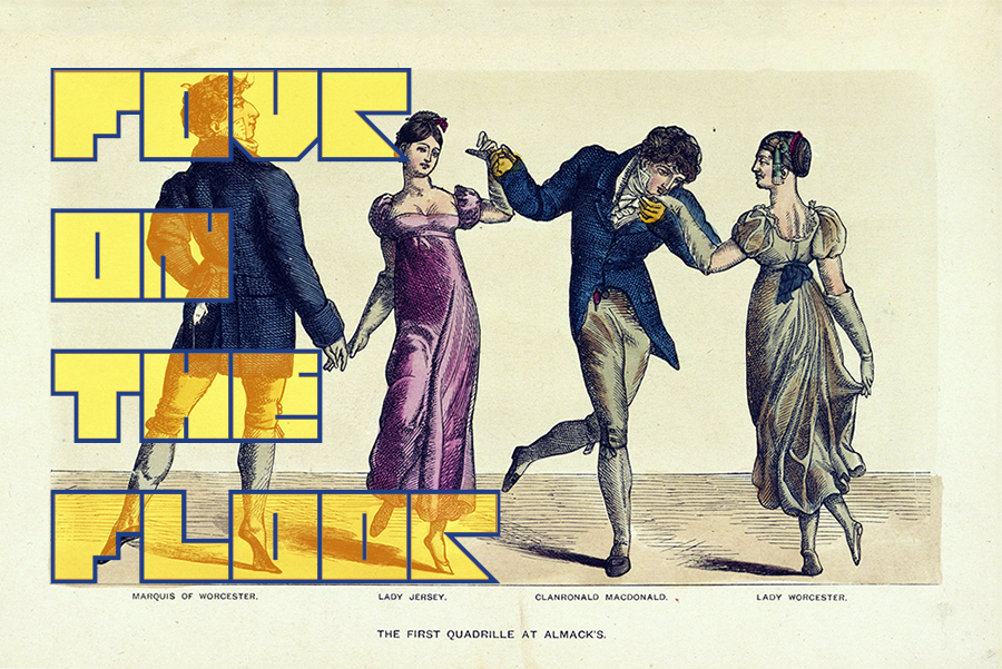
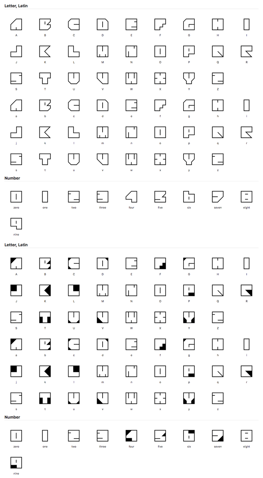
I challenged myself to draw an alphabet limited to a square grid. “Four Four” turned into a 4x4 monospaced typeface.
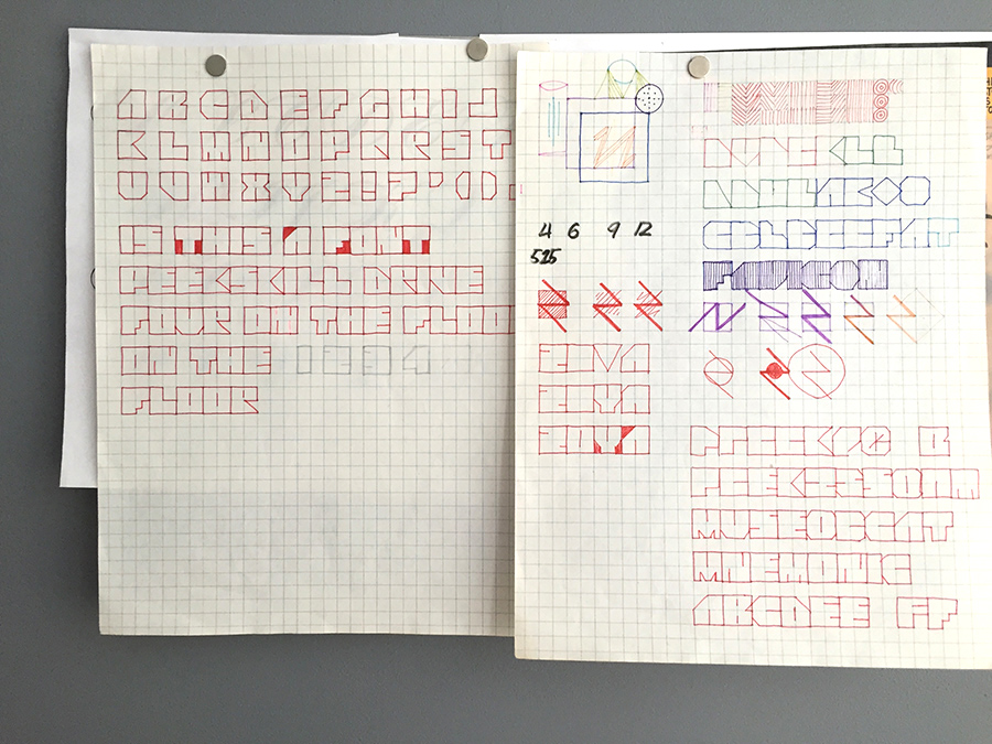
The idea was to make each letter a solid square, so this wasn’t going to be a pixel font. I set up some rules on how to treat diagonals and bowls, since I couldn’t approximate curves. But the rules didn't always create a recognizable letter, so they were sometimes broken.
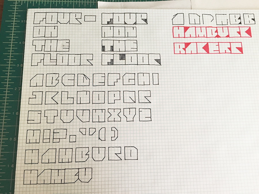
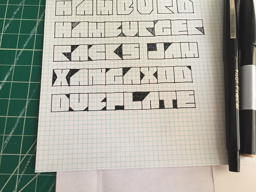
It's useful to visualize letters in terms of negative space, which was easy to do with a square. I shaded areas until they outlined the shape I wanted, basically chiseling away from the block. These "negative" letters looked pretty cool, so I decided I’d make a version like that too.
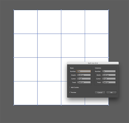
When I felt good about my character set, I moved to Illustrator. I set up an 800x800 px document, split it into a 4x4 grid and converted the grid to outlines. That became my locked guide layer. I then drew each glyph using the pen tool with a 40 pt stroke, holding down Shift to make straight lines. Once I closed a shape, I clicked Align Stroke to Inside to stay within the grid.
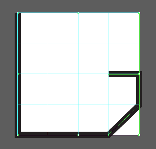
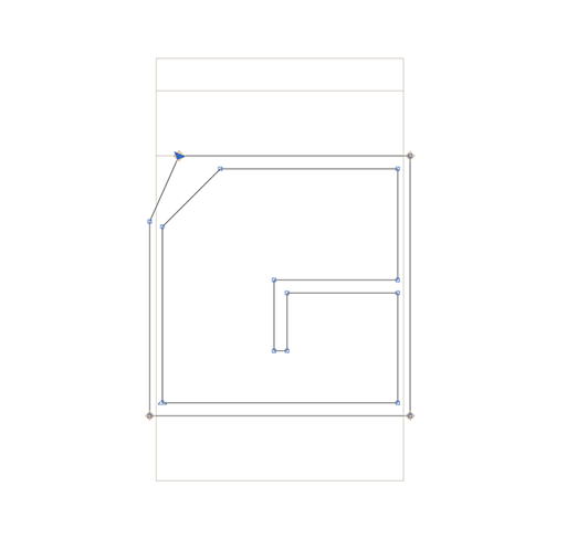
With the drawing all done, I switched over to Glyphs to make the font. I set up an x-height of 800 UPM to match my Illustrator grid, and copied and pasted the characters, positioning them by changing values in the Info Box.
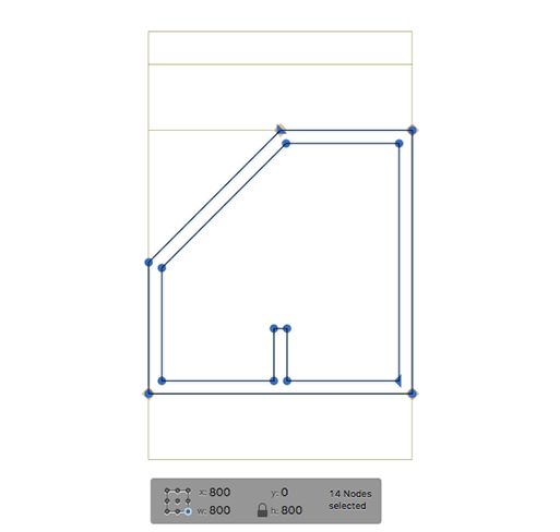
Because Four Four is designed with no spacing between letters, touching lines created gaps within words.

To correct for this, I kerned each character -20 units left and right. On a 40 pt stroke, this joins them in the middle.
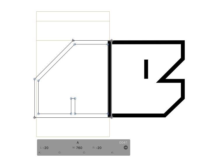

And Four Four was done! To make the Black version, I duplicated the font file, and dragged the Bezier handles in Glyphs to fill in each character square.
Download Four Four and Four Four Black, free for personal use.
